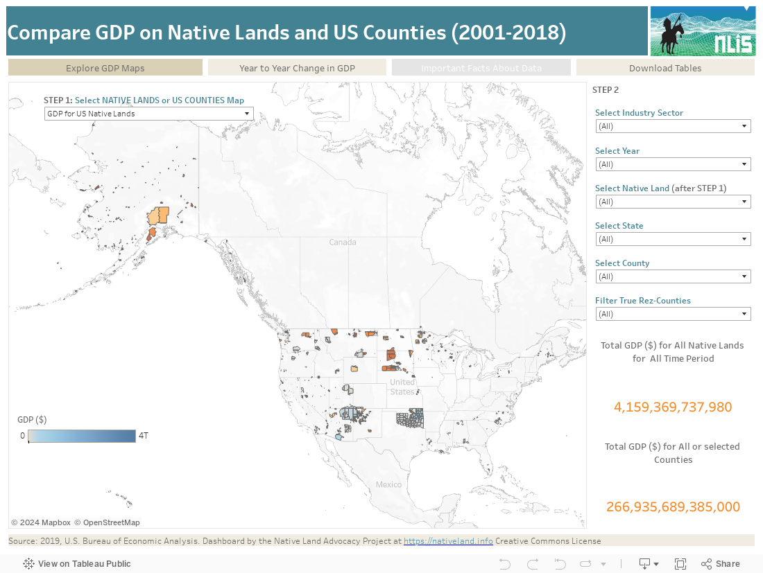
This data dashboard, developed by the Native Lands Advocacy Project, summarizes GDP county-level data from the U.S. Bureau of Economic Analysis (BEA) for 695 unique Native land areas in the United States including Alaska and Hawaii.
This data presents, for the first time, a tableau visualization presenting the Gross Domestic Product by County and by Industry over 17 years (2001-2018) on U.S Counties and Native Lands. The visualization allows for in-viz filtering of GDP sectors by industry (2012 NAICS nomenclature), year, Native Land, and county and/or state.
According to the source of the raw data, the U.S Bureau of Economic Analysis; “GDP is the value of goods and services produced within a county. The size of a county’s economy, as measured by GDP, varies considerably across the United States. In 2019, the total level of real GDP ranged from $22.9 million in Petroleum County, MT, to $726.9 billion in Los Angeles County, CA”.
This dashboard is very unique in that it allows users to view the general county data AND compare it with Native Lands specific data estimates. Native Lands values were calculated using the Rez-County Overlap; our very own GIS layer which enables us to extract county-level data to estimate values for Native Lands based on counties area proportions that overlap with reservations boundaries.
Boundary data used to define Native Lands summary areas was obtained from the 2019 US Census Bureau’s TIGER/Line Shapefile for American Indian areas in the United States which includes both American Indians and Alaskan Natives, a total of 845 unique features or land areas or 695 reservations.
The Bureau of Economic Analysis published, for the first time in 2019, county-level data GDP, and additionally in 2020, the time series presented in this dataset. This data is key to understand the distribution of income by sector on Native Lands and in the United States. The multi-filter visualization tool enables users to isolate specific geographies as needed, for instance, within or between state comparisons. The Year to Year change visualization tracks the evolution of GDP by sector for different geographies and allows at-a-glance comparisons between Native Lands and U.S Counties, enabling users to easily see evolutions and trends across sectors.
Finally, the pie chart completes this picture and offers an alternative visualization of GDP distribution across sectors between Native Lands and US Counties. A summary of the data shows that, although Native Lands make about 2.9% or the entire United States, they capture about 8% of national GDP. This figure is to be pondered with other variables, such as demographic and business structure data, about who captures most of County GDP on Native Lands. It might also be inflated due to the methodological limitations of this study.
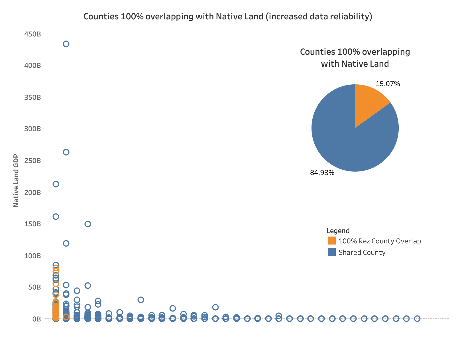
Most of the data collected by the United States Government is aggregated at the State and County level, and because Native lands often overlap state and county boundaries, it makes it extremely difficult to get accurate totals for just Native lands. The method we use to construct Native Lands estimates is to extract county-level data using our own spatial layer which extracts counties values from their proportional overlap with Native Lands. We recognize that this method may involve biases. The most obvious possible bias comes from the fact that reservations may share a county with densely populated areas, which would bias demographic and thus economic data. Our current methods accounts for proportional county sharing, but not for population density and urban areas. Later analyses will review the layer to better mitigate these biases.
One way to eliminate potential bias is to look at and exclude reservations that share counties and only keep those that occupy 100% of the county area. The latter make up about 15% of all Native Lands. When comparing GDP on Native Lands that share counties versus Native Lands with 100% county overlap, the data shows that Native Lands with 100% overlap capture less GDP than others, which suggests that the difference might be due to county-sharing biases.
Although we acknowledge the data limitations, this dashboard is currently the only source of data on GDP for Native Lands that allows for nationwide comparisons.